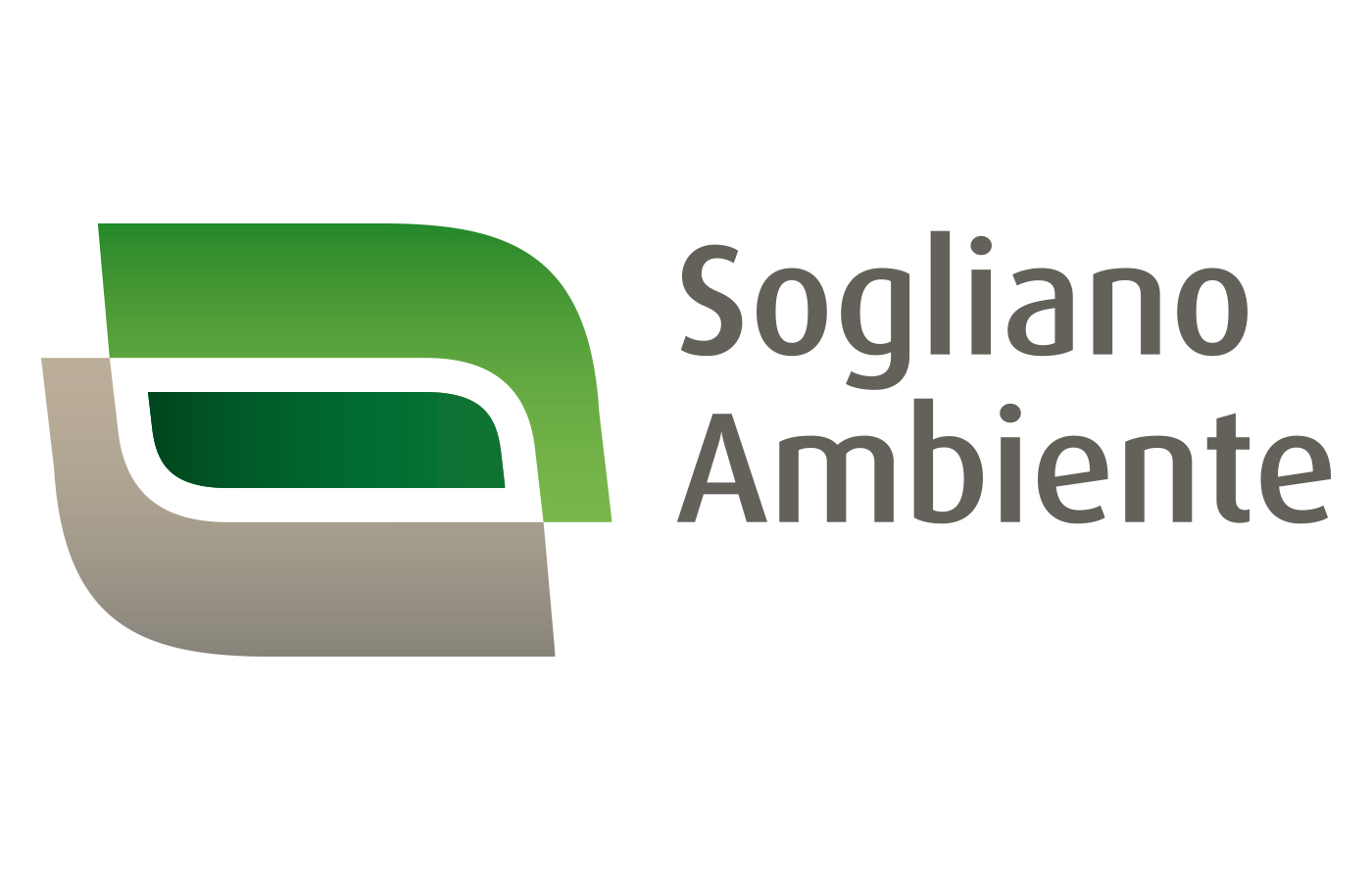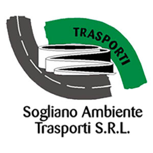
Sogliano Ambiente Company had Studio Pleiadi as its main communication agency for several years. In this collaboration I participated in the redesign phase of the Company logo. The Company deals with waste management, landfills and biogas generation, so the colors of the earth were fundamental to communicate a green concept of this business management. The old logo featured a pictogram of the winding roads that garbage trucks make to get to their landfills, embraced by a green curve, a symbol of nature and a gray, symbol of waste management. My job was to create a cleaner icon, and at the same time communicate better the concept of a green company. The curves of the new forms of embrace in fact create two symbolic overlapping leaves.
Art direction Studio Pleiadi.


